When contemplating an overall approach to sign design and execution, there are many things to consider. What are the successful key design attributes that every business needs to take advantage of? How can a business determine the most balanced and strategic approach for evoking the message of their brand within the local community? How can the business signage produce the highest score across a range of design metrics?
The following five areas should be considered first:
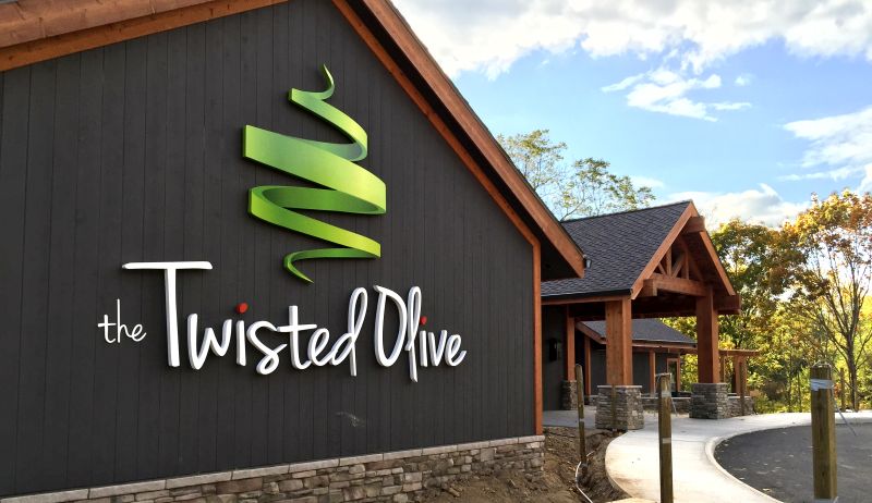
1. Architectural integration
2. Legibility
3. Pleasing to the eye
4. Professional Design
5. Balanced Illumination
It is important to think about the overall architectural intent of the business location. Finding creative ways to incorporate the signage within that style to compliment it and yet find subtle and artistic ways to contrast it as well, is what good design aims to achieve.
A large concern which patrons express is the ability to read signage. With that in mind, keep to simple, strong and legible signs that convey concise messages in clear forms. Avoid Script and small stroke letters. Stay away from colors that blend into the background. Utilize creativity in the message but remember motorists have a short time span to read that display. Make certain that the balance between symbols, types and patterns make for an easy to read sign.
Remember that using color strategically is so important to catch the eye. It can either drive business to or away from. Researching the psychology of colors can be a crucial step in making the right decision when it comes to your sign designs. Red in moderation can draw the eye but too much can be irritating. Some use of blue can be calming but overuse can seem cold. Green is a go-to color for success and peaceful, nurturing energies. Yellow is a cheerful and optimistic color in moderation. Orange has attitude and is energetic. These are just a few colors to consider in your designs. Finding the right balance of color, dimension and legibility can make an eye-pleasing experience that helps drive your message.
Ensure that the signage does not detract from the local landscape. Instead, you want it to add a quality to the view as if, it was always meant to be this way. Does it seem to say, ‘that’s what was missing here?’ If it does, you’ve hit the mark because if your signage is welcome in your business community, your business will be welcome.
An artistic vision however; needs tempered by a professional understanding of how to use these elements in a tasteful expression. Presenting your ideas to an experienced Art Director helps bring useful insight and balance to the project. They can find the function in the forms and nip and tuck at the edges to get all the right curves and lines in place and prune back the excess until the design is perfected.
Lighting up the town in just the right way, can keep the buzz going until long into the night. If your signage is electric, your profits will be empowered. Imagine having the ability to reach your patrons into all hours of the day, simply because you remembered that lighting is an integral role in any exterior sign project. The plan should be to find the right combination of internal illumination of any mounted signs and external illumination to accent architectural elements. In this way, your signage will keep the same appealing look both day and night.
At Akers Signs, our dedicated staff can assist you in tailoring your signage layout to affect an overall professional and artistic panorama that naturally evokes your message and drives patrons to your doors. Take the time to inquire today.
I got such a good information on this topic it’s a very interesting one.